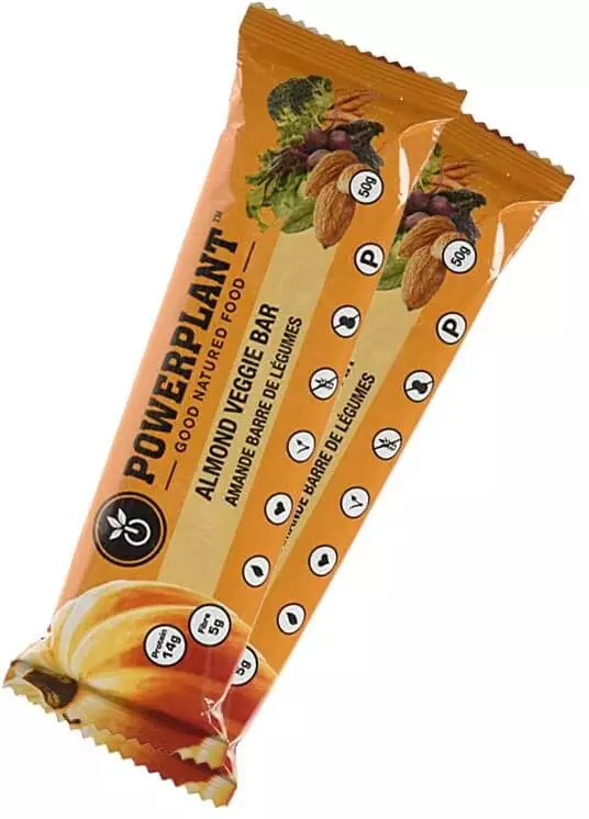
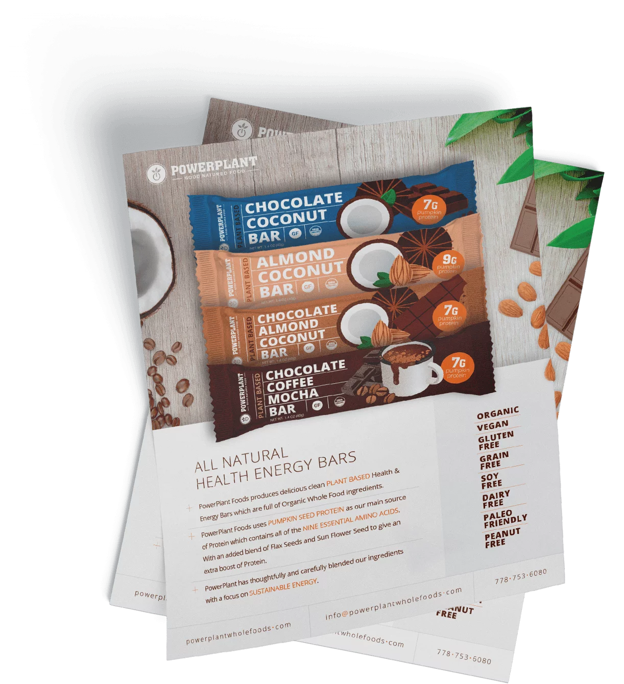
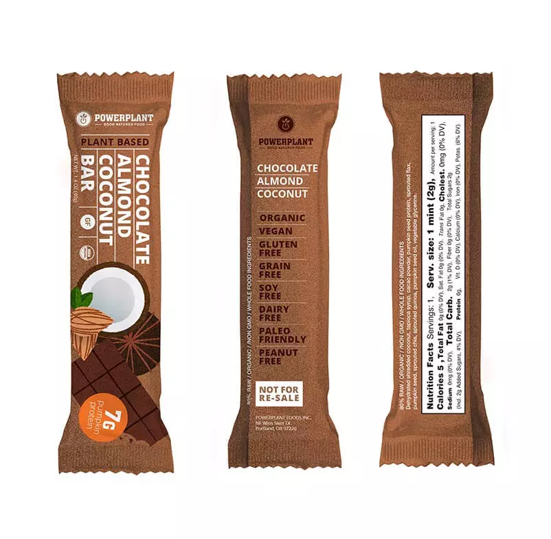
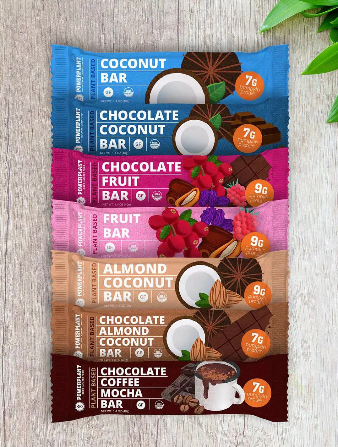
Packaging – it’s more than just a pretty container.


Packaging tells a story. Ideally, it captures the essence of a brand or product. It is the first thing a potential customer sees and should be enticing enough to encourage them to act. In the case of packaged foods, it needs to look appetizing and intriguing, driving the customer to not only pick it up but to purchase it—and keep coming back for more.

About Powerplant


PowerPlant Foods makes delicious, whole-food, plant-based protein bars that give you the healthy carbs and protein you need to energize mind and body to train harder, maximize your workout, and push past limits. Featuring 100 percent vegan, clean, gluten free, non-GMO ingredients, PowerPlant protein bars are perfect for health-conscious consumers and those interested in delicious and convenient snack bars that eschew typical “convenient” components like sugars and flavorings. Comprised of all-natural pumpkin seed protein, brown rice protein, fruits, berries, and seeds, PowerPlant protein bars are an innovative, organic, and delicious alternative to other bars on the market.

(Old design)

Going International


A planned expansion from Canada into the U.S. market led PowerPlant to consult Echo Media Group for the development of a new look and feel for their protein bar packaging. The manufacturer’s Canadian packaging focused largely on the pumpkin protein, including the orange color and pumpkin illustration on the wrappers. For American audiences they wanted to focus instead on the other features and qualities of the bars that made them appealing to athletes, health enthusiasts or anyone looking for a great tasting protein bar. PowerPlant sought to clearly communicate the wholesome ingredients in each of their protein bars through the new packaging design. Knowing that people “eat with their eyes,” Echo Media’s designer quickly got to work redesigning the company’s existing protein bar wrappers to make them more sophisticated and visually appealing.

Spotlight On: Ingredients


It didn’t take Echo long to deliver a packaging solution that emphasized the delicious goodness to be found within each bar. The standout element on each wrapper is the handcrafted illustration clearly depicting the fruit, nuts and seeds in each bar.

The new packaging also features a new typographic treatment, as well as consistent design elements—including a subtle nod to the pumpkin from the Canadian packaging design.

That's A Wrap!


Though PowerPlant approached Echo looking for a new wrapper for their protein bars, what they really wanted to create was an experience. Echo delivered seven unique product wrappers that are also unified in their design aesthetic, making it easy to recognize the family of products sitting on a shelf.

Why Echo -
30 Years /
300+ Clients /
Proven Professionals

Blending strategy, design, marketing & analytics for measurable results that delight clients, and ignite brands.

Awards & Certifications

  • Web Designers near me

  • Google Ads Search Certification

  • Google Ads Video Verification

  • Google Ads Display Certification

Stay in the know

Sign up for the latest information from Echo Media Group

  • This field is for validation purposes and should be left unchanged.